
Using Web Photos
Learn how to visually represent Ole Miss on Cascade.
A Picture's Worth: Making the Most of Images in Cascade
Web users are visual. Our eyes are trained to find, understand, and judge digital images in milliseconds. This process happens without thought, almost entirely subconsciously. But, just because our users process images quickly doesn't mean we can neglect them.
- Images are incredibly important to not only telling stories but in keeping our users engaged as they navigate olemiss.edu
Images let users know immediately who Ole Miss is and give them a sneak peek into our beautiful campus. But a bad photo can have just as much to say about Ole Miss as a good one.
- When brainstorming and taking photographs you need to first think about where the photo is going to be used on the website. Some places on the page only allow for certain photo sizes, which will affect possible photograph options.
- If you want a deeper dive into the world of Ole Miss images and videos, check out what our Brand Site has to say.
- If you want to browse already existing images check out Photoshelter and the Widen Collective.
5 Ways to Make Your Photos Look Best on Cascade
Most of our partners across campus will be using general pages to get their content onto olemiss.edu. But we might also find ourselves working on department pages and landing pages as well and trying to find the right HERO image to help the page pop.
Here are the different image considerations you should remember for different page types:
- Department Page. The Department Detail Page is unique among the other pages because it's HERO image is in the portrait orientation, not landscape.
- Because of it's orientation, close-up, intimate images of a few people work best for Department Detail Pages. You could showcase a building, but in the end, people will always be more interesting the a stack of bricks and a couple of windows.
- HERO images for Department Detail Pages are optional.
- Landing Page. Landing Pages are reserved for the navigation bars at the top of olemiss.edu and other school subsites, which means you won't have to create one of these pages from "Add Content." (If you do, you probably need a general page.)
- Images for Landing Pages are difficult because of the triangular apron that bisects the image from above. For Landing Pages images that have a lot of head space or have notable details in the bottom half, or either side of the photo, work well.
- HERO images for Landing Pages are required.
- General Page. A General Page is really the meat and potatoes of olemiss.edu (e.g., we'll use these pages more than any other). The HERO image for a general page is horizontal, and allows for a great deal of versatility.
- Images for a general page can include exterior building shots, shots of student, staff, and faculty, and places around campus, the region, and elsewhere.
- HERO images for General Pages are optional.
A page is made up of modules. They help us showcase different information and link to other pages in Cascade. Some modules don't allow you to pull in your own picture because it's done automatically (e.g., the Profile Detail Module). But some do give you a chance to choose a specific image.
Here are the different image considerations you should remember for different types of modules:
- Checkerboard. Checkerboards are some of the unique ways to show off photos, allowing the users eye to zig-zag across the page. What's more interesting is how the checkerboard let's you choose to float a small image on top of a larger one. Whatever you use in a checkerboard here are some things to keep in mind.
- Have the faces and actions of your photo bring the user's eyes back to the center of the page. This will help keep the user's attention on the information that matters.
- If you layer a small image on top of a larger one, make sure that the photos work well together (e.g., don't cover up the large image with the small one).
- The large image on a checkerboard is required. The small image is optional.
- Listing. Listing Modules are a great way to stack information and offer a link. If you'd like to can use an image as well. Keep in mind that images in the Listing Modules are pretty small and as such are hard to see. If you put a group photo in a listing module, you're wasting the opportunity.
- Use a images that can clearly show their information in a small format, close up or near-close work best.
- WYSIWYG. Let's be real for a second. WYSIWYG's aren't the best to show off images. The images move around a bit. The text doesn't know where it wants to live. You may spend an hour just trying to get things to stay put.
- When using a WYSIWYG, make sure to use images that don't distract from the formatting of the text. If you need to break up the text with a centered image, go ahead. Even if it's a little larger, the clean way it integrates with the text will help readability.
- Testimonial. If you're making a testimonial, check if there's already a staff or faculty profile for the person you're trying to show off. If you're showcasing graduate workers, student ambassadors, or alumni, you should do the same thing.
- If a profile already exists, just pull it in to testimonial automatically.
- If it doesn't already exist. Make sure that the image is a portrait, well-lit, and properly focused.
Because modules are different, they may have different size requirements for your images. While some modules will automatically crop images if your image size is off, other modules won't except your images at all.
Here are some common image size requirements you should know:
- Employee, Graduate Student, Student Ambassador, and Department Pages:
- 500 X 660
- Hero images:
- 1232 x 690
- Landing Page Hero images:
- 1232 x 800
- Testimonials built manually:
- 360 x 490
- Checkerboard:
- Large: 650 x 624
- Small.: 320 x 320
- Listing:
- 360 x 230
- Publication image (for employee profiles):
- 193 x 250
How do I resize my images?
Resizing your images may require a bit of cropping. Don’t worry, this isn’t hard to do.
Here are some of the tools that you can use:
- Adobe Suite products (Photoshop, Indesign)
- Canva
Whenever you are bringing an image to a page in Cascade, you need to make sure you put in the right folder.
- If you don't it could wind up in an entirely different place, making it hard for you to find it, and it could clutter up someone else's workspace.
- What's worse, is another editor may see the image and delete it thinking it is a mistake or a glitch. If that were to happen, then your page or pages will no longer have the digital assets you worked so hard for.
Luckily, placing your image the right folder is easy. Here's how you make sure your image is going into the right place:
- Start the way you do when uploading any image into Cascade. Go to "Add Content," select the folder labeled "Default," and then select "File."
- When you select "File," the following window will pop up in your browser. This is where you name the image you're uploading, and make sure that it's going in to the right "Placement Folder."
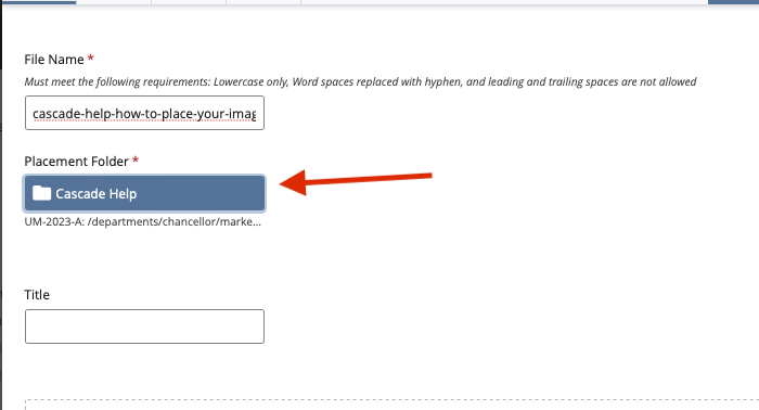
- You're placement folder should always be related to the page that will showcase the image, that way it's always easy to find and replace or update when you need to.
- To make sure it's the correct placement folder, you can reference the folder name or click on the text just beneath the field to expand the folder's address in the asset tree.
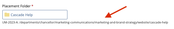
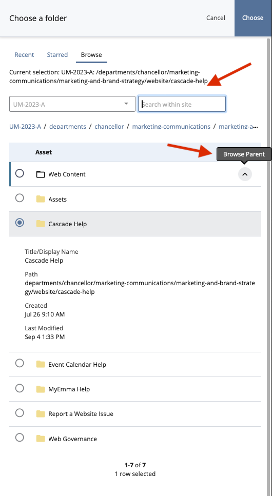
- If you realize that Cascade has picked the wrong "Placement Folder," click the folder shown and a window will appear on the right side of your browser.
- Click browse and navigate the asset tree (or search in the search bar) to find the folder you need.
Remember: Puting your images in the right folder doesn't only help you, it also helps other Cascade users. Make sure to put all of your digital assets in the proper folder every time.
Again, when we showcase the vibrant life of folks on campus, in Oxford, or the region, it's hard to go wrong. We want our images to be inviting and speak to the fun, diverse world that is Ole Miss.
- But there are a few types of images you should avoid using. In as few words as possible: The boring ones.
To be more diplomatic, images of charts, infographics, word clouds, and any images of text, don't help our users understand who we are. In fact, these images will be overlooked nine times out of ten.
- More importantly, charts, infographics, word clouds, or any image of text are a nightmare for accessibility and don't help screen readers convey our message.
- If you have to use these images, make sure you make them matter. In other words, be prepared to talk about the information that they show. Make sure to provide context, explain the chart, and offer a take away.
Here are a few other things to remember:
- If you are using pictures of buildings or interior shots inside buildings, don't be misleading. While the large globe in Bryant Hall is really eye catching, don't use it as an image unless your page is related to Bryant Hall in some way.
- Our campus is historic and constantly changing. You may find photographs that have some "historic" looking buildings in them (e.g., a tile roof that is now also an ecosystem). Let's put our best foot forward and use pictures that feel more "glow up," and less "worn down."
- We can spot a staged photo a mile away. Authenticity is the name of the game and a staged photo is anything but authentic. We are surrounded by photogenic and exciting students, faculty, and staff that are more than happy to represent our campus on olemiss.edu. There's no reason to make our website look like we bought image rights from adobe or Getty images.
Still Need Help?
Whether you're working in Cascade, MyEmma, or the Event Calendar, the Web Content team is here to help you get your message out there.